Laker


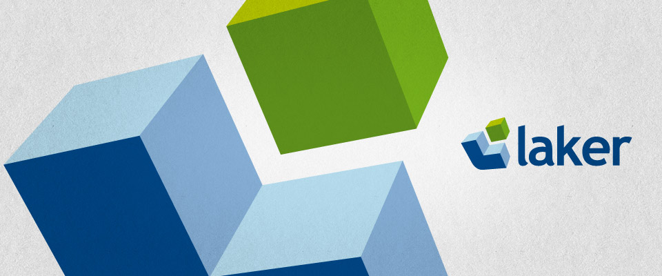
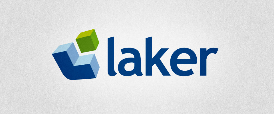


Laker are one of the Midland's largest and most experienced facilities management companies, specialising in the repair and management of social housing and educational facilities for local authorities and commercial properties for the private sector. They approached us looking for a new image that would better represent their business in a modern market and breath new life into how their brand was perceived by their current and potential customers.
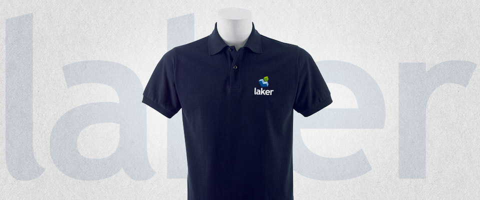
They wanted the new logo to encapsulate the ideas of facilities management and also get across the notion of a building and construction company that also delivered services through the use of cutting edge technologies; all of this with an approachable and familiar feel. The new identity also had to be very flexible and highly recognisable to ensure that things like site vehicles stood out and company uniforms looked smart and modern. A big ask and a complicated set of requirements to combine into a single identity.
They wanted the new logo to encapsulate the ideas of facilities management and also get across the notion of a building and construction company that also delivered services through the use of cutting edge technologies; all of this with an approachable and familiar feel. The new identity also had to be very flexible and highly recognisable to ensure that things like site vehicles stood out and company uniforms looked smart and modern. A big ask and a complicated set of requirements to combine into a single identity.
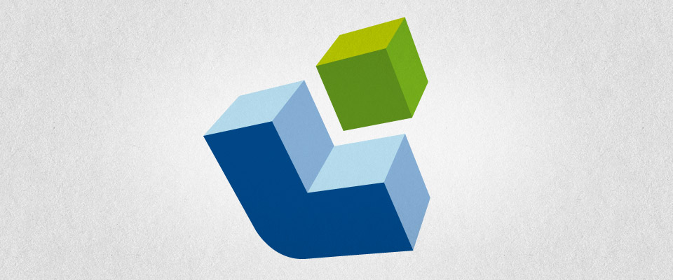
The final execution completely reinvented the company, presenting it in a startling new, modern light. Out went any semblance of their old identity (sometimes it can be hard to let go of your heritage but the benefits can be worth the pain), and in came a new look that blew away all of the cobwebs and repositioned them as a company that was modern, technically adept and competent. The added bonus of such a strong departure from the old look was that the direction we helped them take ensured that they stood out from all of their competitors who continue to look much as you would expect.
The new Laker... brighter, fresher, more modern and now one of the most visible brands in their sector.
The new Laker... brighter, fresher, more modern and now one of the most visible brands in their sector.